But before BoJo gave us all the go-ahead, holiday park operator Parkdean Resorts came to us with one goal – to own the Great British Staycation market post-lockdown. And so we’ve worked with them to launch one of our biggest creative campaigns to date, Sandtone, which celebrates the beauty and diversity of Britain’s best beaches.
Carrie announced its launch last week on Twitter, and we were humbled by the love (and likes) that it received online. But that got us thinking…
In the creative industry, we only ever really show the final, polished output – the bits that make us look our best. While Sandtone is a project we’re super proud of, remote working meant it was far from plain sailing. So, here’s a whistle-stop tour through how we made it. I’ll explain what we did and why we did it, plus let you in on a few secrets from my first campaign with Rise at Seven.
Pastiching Pantone, a household name
The campaign was anchored by a simple concept – to immortalise Britain’s beaches in a pastiche of the graphic language made iconic by experts of colour, Pantone.
What started as a small idea, snowballed. In typical Rise at Seven fashion, we wanted to push it as far as we could. To create something that combined everything we’re great at – creative, content, and search – into an integrated campaign that engages customers at a range of touchpoints both online and off.
Go hard AND go home - how did we do it?
Last year, Carrie had an idea to compare UK beaches based on the colour of their sand. She didn't know what client we could run this campaign for, but made it her mission in the meantime to gather sand samples from up and down the country; ready for when the perfect client came along. She was able to gather several samples from beaches in Cornwall, Scotland and East Coast... but then COVID-19 hit.
With every Riser now WFH, we immediately hit our first roadblock. Travelling the length of the UK to get sand from every beach was impossible for those who weren’t Dominic Cummings, so how were we going to collect all the colours in the first place?
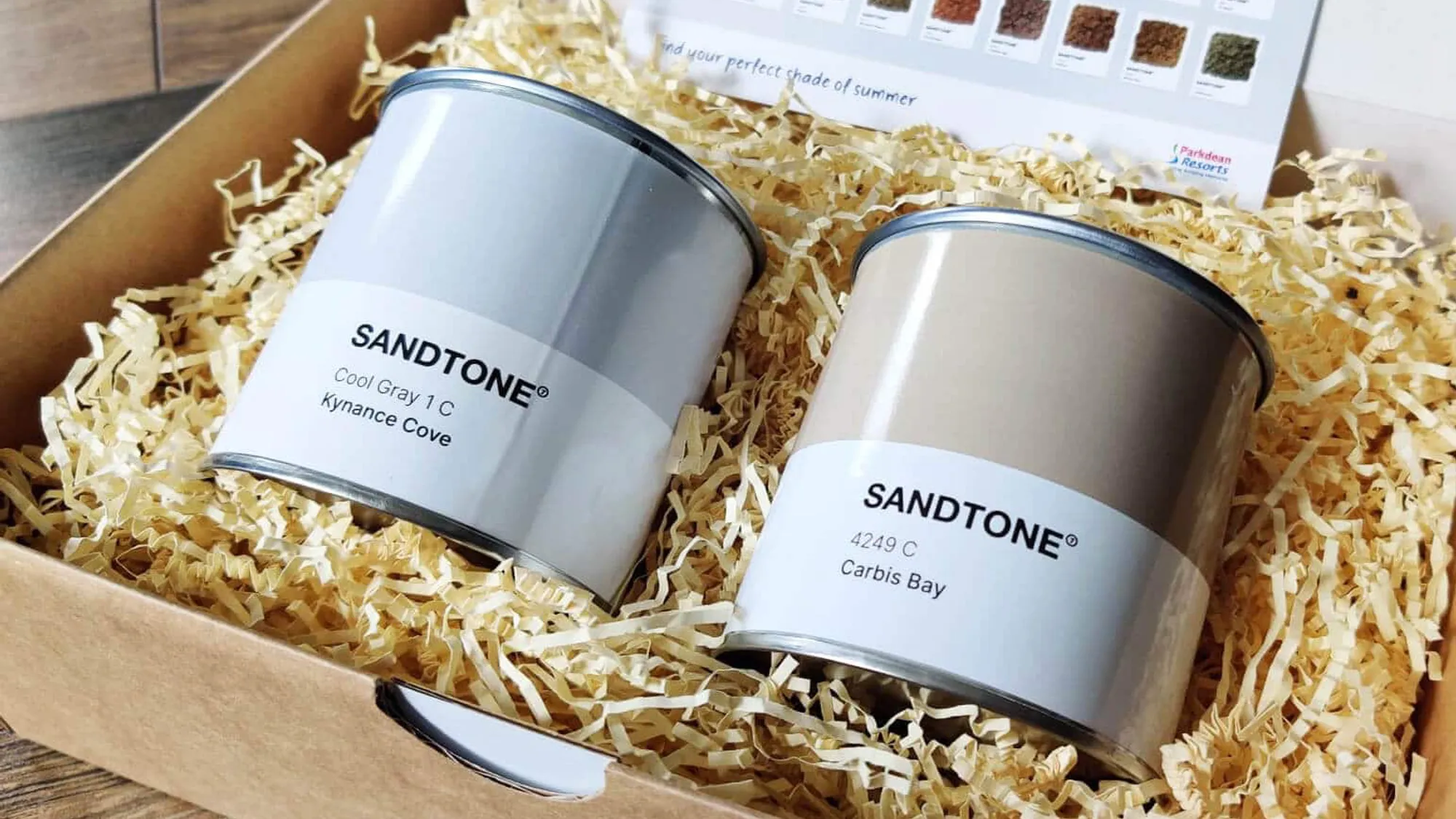
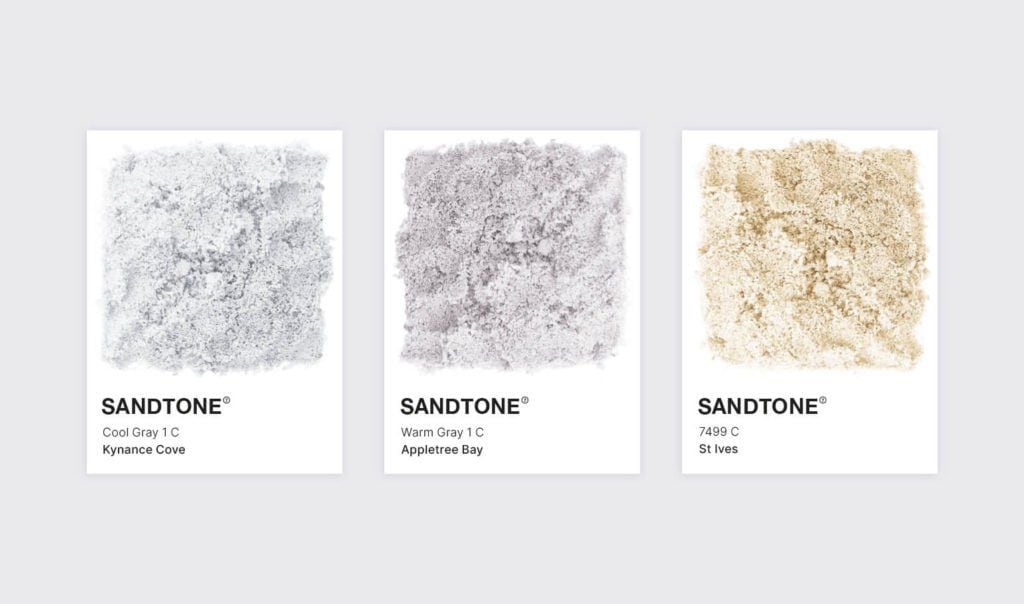
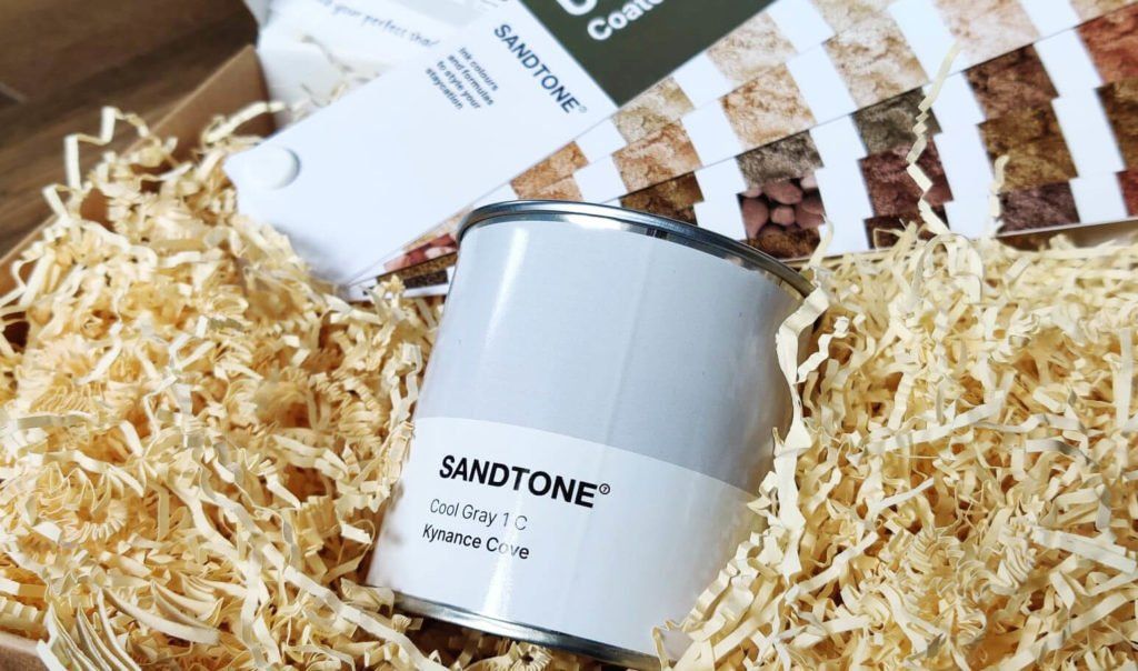
We doubled down on a tactic that could be done remotely. After gathering 50+ photographs of popular beaches near Parkdean locations, along with samples of sand for accuracy; we were able to colour-pick and assign each a swatch with the help of the Pantone Studio app. The end result was a list of codes for destinations up and down the country, ranging from Kynance Cove in Cornwall to Cleethorpes on the East Coast.
The not-so-sexy shoot
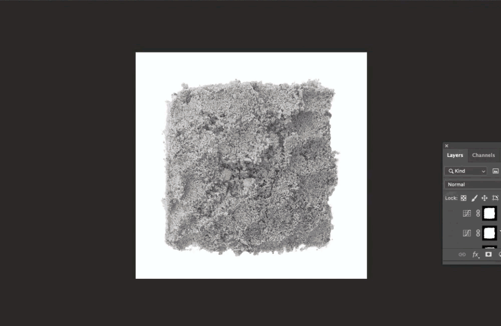
Never ones to make it easy for ourselves, we wanted to introduce the texture of the beaches too, and for that, we needed real imagery of the sand and stones (and a smidgen of Photoshop magic).
With no fancy equipment to hand, we had to be crafty about execution.
Senior designer Cat set up a shoot, arranging squares of sand onto sheets of A4 in her back garden, snapping the shots on an iPhone 8. We waited for the afternoon to maximise natural light (she’s currently selling her house if you’re interested in a lovely south-facing garden in Sheffield). The images were then dropped into Google Drive only to be downloaded minutes later by me, over 30 miles away in Leeds.
In Photoshop, the images’ backgrounds were stripped out and the original sand’s colour removed. Getting realistic new colours is always tricky, but through matching LAB colour readouts, we were able to achieve each beach’s precise swatch. We exported them all and were one step closer to what we had in mind for the project.
Roll up, roll up (and roll out, roll out)
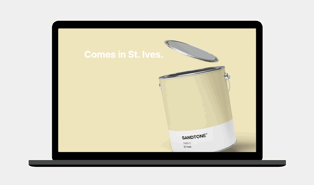
Numerous content arms were created to build awareness and tie creative and search together. From Instagram filters to billboards, paint tins to paid social. The latter of which called for the design of hundreds of social assets, designed for use across all platforms. These assets paired all 54 beaches with their Sandtone swatch, charted dunes from light to dark, and even pulled out region-specific sands.
We also created a landing page to gain links, traffic and push audiences straight to Parkdean pages with the help of a few punchy CTAs. Areas of interactivity boosted dwell time too. So whether you’re simply scrolling through swatches, searching by location or sitting through the Apple-inspired parallax feature – every section offers up a visual feast.
The devil’s in the detail
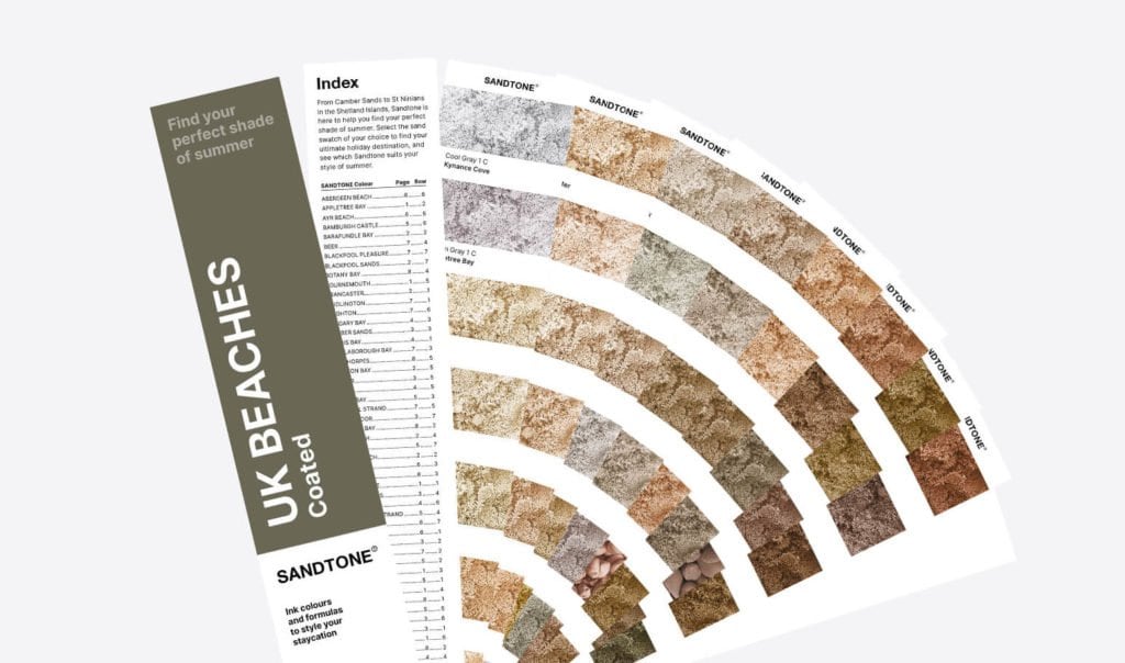
We parodied Pantone’s famous swatch books too, ranking the beaches from light to dark. Manipulating this iconic product and pairing it with paint pots and postcards helped us to build a well-considered press pack to catch the eye of key journalists. We drove detail to the nth degree; even the tiny page and row numbers on the busy index page are accurate.
Those with a keen eye will even notice that we sneaked a small ‘7’ into the trademark of the Sandtone logo.
Nuff said, really.
The gripping conclusion
If one thing is clear from working on this Sandtone campaign, it’s that you don’t need fancy equipment to nail a creative project all the time. Working from a dozen spare bedrooms across Yorkshire (and London), we improvised with what we had at the time to deliver high-quality work to a tight deadline.
And the results are shit hot, even if we do say so ourselves.