HI! Joe here.
As new Creative Director for Rise at Seven, I thought it's only right to put together a 2020 list of my favourite campaigns and content of the year. You can’t spell Creative Director without “Art or Erect” so this is what got us going through this hellscape of a Gregorian time slot.
It’s been… a tough one. I’ll try not to mention the C-word too much (no not that one, no not that one either) but Lady Rona has undoubtably had a profound impact on creative and, well, every other element of our corporal existence. Not only has it ostracised us socially from our nearest and dearest, but it’s changed the very way we live our lives on a day to day basis.
It’s been fascinating to see how the creative landscape has pivoted reactively, and really shows that as an industry we’re capable of so much agility when we get the right brains involved.
So without further ado, here's my top ten which definitely doesn't change every day.
1. KFC
How many brands have such a dedicated following that when their product becomes unavailable people REPLICATE their own versions? Turns out we, medically, cannot live without fried chicken for more than a week - so KFC switched on their user generated content gathering machine known as The Internet and created this short but sweet masterpiece when the chain could re-open in May of this year. Also, quick shout out for ditchin’ finger lickin’ due to the C Bomb; that was super smart.
2. GUINNESS
This one was technically Jan 31st 2019, but time is no longer linear and it’s really good so, report me to the cyber police.
Part of the brand’s responsible drinking Rugby World Cup campaign, and not shy to the odd bit of award winning marketing, Guinness introduced a “new, alcohol free” version of their stout. The twist being, it’s just bloody water. It lands the message beautifully, as well as working a bit of wonder on the old myth of Irish water being the secret to its unique taste. Working with a couple of rugby players to test the drink at Guinness HQ, you have a recipe for very bland tasting perfection.
3. NHS
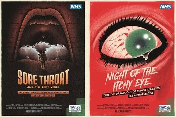
The public sector has had a lot to contend with this year, but just before *word klaxon* Covid fucked everything up for the entire world, the NHS came along with this dazzlingly horrifying campaign to persuade the more hypochondriac of us to just go to the pharmacy instead of a GP and basically stop being a big crying baby about everything. Anyway the results were this wonderful bit of horror film inspired poster campaign. The artist himself has worked on Disney, DC, Marvel, Star Wars, Pixar and PlayStation art work, so this really felt like the real deal.
4. LEGO
Where to even start with this brand. Every year (month?) there seems to be another brilliant execution or collaboration, going from strength to strength. This one picked up steam early in the year and brought more than just tears to the eye. Lego developed a special braille covered brick that empowered and enabled visually impaired children to play and learn with the legendary product more than ever before. Combining the pleasure of building, making, creating and learning, Lego went above and beyond and continues to be disruptive in the category in the most delightful ways imaginable.
5. BURGER KING
So many executions, so little time. I feel like the football work the brand did has been covered and is still rumbling along, so I personally wanted to include the groundbreaking Moldy Whopper as part of this list instead. The content really does the talking here - a super simple idea, rooted in insight and urban myths of the million year old McDonalds meals simply never rotting due to nasty ingredients. This campaign achieved mixed responses (interestingly vastly different ones in the industry compared to consumers), but for sheer disruptively and gross-out creativity, it’s on THE LIST.
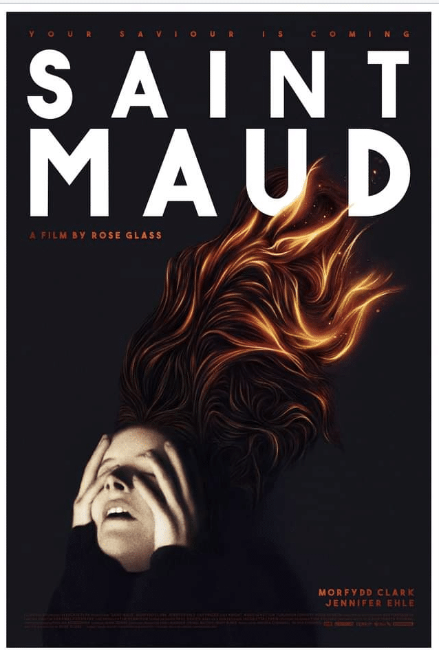
6. SAINT MAUD
Shoutout to @JeremyArblaster on Twitter for reminding me of this one - a bit of a curve ball as it’s nothing to do with brands or ‘owt but fuck me, the poster campaign for SAINT MAUD, one of the most celebrated and aesthetically seductive horror films of the year, was impeccable. Safe to say A24 consistently smash it out of the park when it comes to their creative work, to the extent that the brand has a range of underwear and stickers and books that I may or may not have spent hundreds of pounds on during lockdown. I’m yet to see the film, but I’m saving it for a special occasion (I guess another pandemic or meteor strike or zombie apocalypse or something).
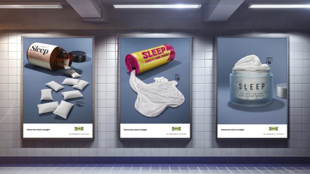
7. IKEA
Again, one of those brands who have the creative bravery to play with their product as much as possible (they’ll go blind one day). There always seems to be an IKEA execution in these round-ups and tbh I’m never tired of them. This year they utilised OOH advertising with some genre mashing, industry pastiche-ing cheekiness. The real genius here is the way they blend sleep with their existing, basic bedding range VS the variety of different manifestations of sleep in different verticals. It just shows that ideas do the hard work, not the product. The simplicity is key here - an image that does immediately what is asked without the viewer needing to do much mental gymnastics to get there. This is what happens when you trust your creative team. KISS - Keep it simple, sexy.
8. NETFLIX
Okay okay I know we’re getting into slightly predictable territory here, but this one was too good to miss. When shit hit the fan-dom, Netflix knew two things: a) it’s probably best everyone stays indoors and watches Netflix for now, and b) it’s probably best everyone stays indoors and watches Netflix for now. Leveraging their industry leading (owning) portfolio of programming, Netflix continues to tell stories through their channels in a way no other brand can right now. This execution with the threat of spoiling your favourite shows by simply GOING OUTSIDE was apocalyptically creative.
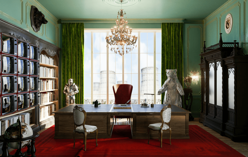
9. HOME ADVISOR
Being a Simpsons fanatic (all of my clothes are Simpsons related and I can’t go 4 mins without quoting something no one understands anymore because everyone that works at Rise is twenty years younger than me) this Home Advisor “What if Wes Anderson Made The Simpsons” campaign very much caught my eye. What I’d do to live in an aesthetically pleasing Simpsons world, and as I’m typing this I’m realising this is actually possible so will be leaving soon to redecorate my entire life. Thanks Home Advisor, this is eeeexcellent.
10. BUMBLE
This one is kind of like if Alan Bennet was a millennial community manager for ASOS but was also watching The Crown and the result is delicious. Dating has been ChAlLeNgInG through *PANDEMIC KLAXON* COVID-19 - where to meet, what to wear, mask or no mask, is this legal, where are my shoes and all my other clothes, am I over my ex, do I even live here, what is reality etc etc etc.
Anyway Helena BC (before Covid) brings all her dynamic range to this beautifully shot and deeply relevant spot for one of the leading dating apps on the scene, and it just flies by with breezy editing. Feels like a palate cleanser. A permission giver. in these frustrating times, to just be yourself and that’s more than good enough. It didn’t exactly break the internet but it’s not all about The Hits…
.....11.....?
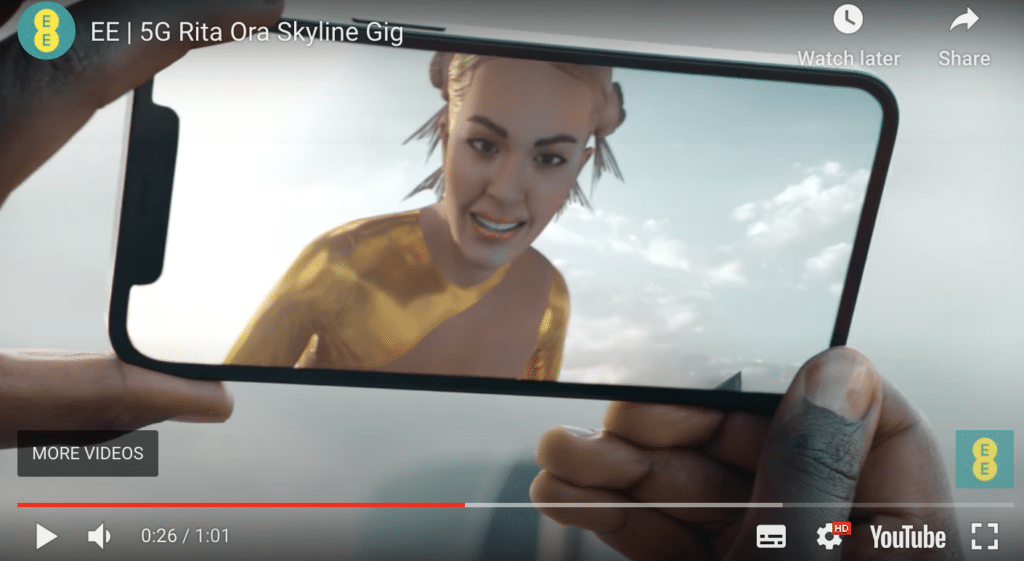
FINALLY I just wanted to share the worst thing I’ve ever seen (my words not Rise's) and I hope we bury it under concrete at the bottom of the mariana Trench so future civilisations cannot find it: The Terrifying Rita Ora AR experience by EE. It looks like if The Sims got stuck in The Matrix and I had to then tell my therapist about it using interpretive dance.
Follow me on Twitter if you want to see what we are getting up to and the next creative campaigns to come out of Rise at Seven

